

"Rewilding" Bethesda and an Airport
A Mural for a Metro Rail and Bus Terminal, Terrazo for an Airport


I recently discovered Graphic Rewilding [click to visit], a group of artists dedicated to introducing natural forms to stark urban environments. It reminded me of this mural idea I submitted to a competition in Bethesda, Maryland, a few years ago. Yeah, I would have “Rewilded Bethesda.”
Some spaces sort of scream for some nature. A call for entries had me standing in Bethesda, Maryland, staring into an immense opening in the ground — the entrance to the Bethesda Metro Train and Bus Terminal. It was a concrete canyon, to be sure, supported by a series of cast concrete columns. There was nary a tree in sight. A fountain cascaded in at one side. At least it had water.
Architect Harry Weese actually created the spaces of Washington’s Metro as a Brutalism/Minimalist statement. He specified that their be no murals, but four decades later the imposing fearsomeness of the spaces had the leadership of Bethesda, Maryland creating public art.
Was it successful? Our studio submitted a very natural floral mural... a continuation of the theme began in the Hollyhocks Mural in Charlottesville. Our goal was indeed to overlay the stark entrance/bus shed with a natural imagery to create an inviting space. I joked to my colleagues: “This won't win. Bethesda Arts likes stark geometrics.”
Sure enough, the winning design was stark and geometrical. Though it has vibrant colors and is a good mural, it's Mayan hyroglyphs read to some people more like a diagram of underground utility piping. Not exactly the way to make the space more inviting unless the artist is David McCauley, who we all know ROCKS the cutaway illustration. Here are some interesting comments from the article that follows:
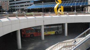
The Metro Train and Bus Terminal Before…
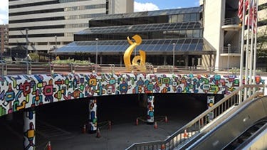
…and After. Mural by Juan Pineda.
Let’s Cover Blank Walls with Public Murals
By Dan Malouff
[click to read]
One of the most basic tenets of good urban design is that walkways should be lined with things to look at. Blank walls discourage walking because they make a walk seem boring and therefore longer, and because empty and lightly maintained spaces feel less safe. Detailed, colorful places are inherently more pedestrian friendly than dismal, blank spaces, and therefore urbanistically superior. So, given that, why do we accept so many blank spaces in our cities? (read more)
Scott on February 3, 2017 at 8:02pm
One man's art is often another man's grafitti. The original design for the Metro by Harry Weese specifically excluded art to avoid the discussion of what is appropriate and what is not. Have you all seen the awful mural that was added at the Bethesda Metro Station? I even like modern art, and this thing just looks bad, and is not good urban streetsscape design. Public art and heroic sculpture is a great idea if well done, but I have seen some very bad and tasteless artwork in public places.
Another topic is the fine line between thoughtfully commissioned murals and illegal vandalism. It really is difficult to enrich the public realm without offending at least some of the public. I vote for great lighting, interesting textures, useful way finding signage, even some bright colors but suggest that unless art is carefully curated, we should avoid filling our city with poorly conceived murals.”
John D on February 5, 2017 at 11:22am
I have to agree that the mural at the Bethesda Metro Station is spectaculary awful. it's easy to visualize alternatives for that space that would be simpler, more durable, and more complimentary to its environment. So if that's an example of what we might get, I'd have to vote for more advertising to fund the system, too. At least ads get vetted by someone's marketing department and has to meet a quality hurdle.”
At this point, I want to emphasize that having designed a mural concept for the space, I can say flat-out that it is a difficult space. Juan Pineda did a nice job with it. The problem is with the process, as well as the space. The bus shed is awkward in scale and the Metro escalator is long and scary. I noticed many able-bodied people opting for the elevator. I rode that escalator a number of times to get a sense of the sequence one went through going to Metro.
I rode down as a man and his girlfriend (or wife) descended in front of me. She was laden with packages and he, carrying nothing, followed her down. I slipped down the left side and placed myself in front of the woman, simply because Southern men are taught from childhood to place themselves between women and danger. I rode down the long escalator standing there. The old escalator gave a rather wobbly ride and I thought of how one of these Metro escalators had actually failed – freewheeling down during a day when hundreds of thousands visited Washington for a Pro-life Rally on the mall.
The media was often guilty of downplaying the numbers of Pro-life Rallys, so as the official ridership of the day became public record as part of the investigation, it was shown that there are a lot more people riding the Metro on a day when there’s a Pro-Life Rally than the media would like to admit. Thankfully there were only minor injuries and the most harrowing image of the day was that of crushed baby strollers. I would call it a miracle.
But back to the rude man and the laden lady -- That little moment convinced me that bringing beauty and nature into the space might be a very good thing. I wanted at that point so desperately to break the spell of that dirty brutalist space... but it was not to be. About forty of us were competing for the opportunity and the $30,000 muralist's fee. I was able to see some of the other entries. There were quite a few geometric designs (design to competition committee), and I liked many of them more than the winning design. I just wish we’d all been working toward a bit of Graphic Rewilding. Would commuters have liked that more? Next time, let’s ask them.
In the end I was satisfied that I had created a good solution and that on another day another committee might have wanted something ‘different.’ But this time the committee opted for what they had financed earlier in a retaining wall mural. If anything, the lesson here is that when public monies are to be awarded for public art, a transparent selection process, with public input on the front end, would probably make for a better experience for everyone — especially the artists. Lately I have seen municipalities issue a call for qualifications and portfolios rather than a call for entries. A group of selected artists are then asked to develop a concept, based on the portfolio they have submitted. The selected artists are then compensated for their design time. Then the committee selects one artist to do the project. I think it is appropriate to ask people, “What do we want there?” “Would people descending into a concrete maw actually like a bit of nature?”
Icalled my concept Elysian Lilys. My idea was that a large natural element might indeed create a welcoming environment overlayed on Weese’s Brutalism and was sufficient in contrast so as not to take much away from it.
I think it will find a place good home in urban fabric someday.


Elysian Lilies, Design by Bob Kirchman
A Capital Vision
Harry Weese's Metro Design

Harry Weese Rendering

Harry Weese Model
Harry Weese’s original design for Washington’s Metro system did indeed create a ‘crypt’ for the Federal City. It was meant to be somewhat devoid of ornamentation, depending on allusion to Classical vaults to tie it to the design of the city above. But there has always been some argument about the other spaces – the above-ground portions, for example. Did Weese intend them to be some stark brutalist viaduct? I found the above rendering by Weese’s office that shows a raised portion of the Metro at Reagan International Airport.
The Trains float on raised tracks supported by the ubiquitous round columns, but note that in the rendering the columns are integrated with the vegetation of the site – in this case the artist has placed them among the hydrangeas (going by scale and color), and vines, climbing the columns. The rendered design seems to be admitting that natural colors and forms of landscaping were to have softened the brutalism – especially in the vicinity of the airport and Arlington’s Cemetery.
Terrazzo Floor Designs for a Coastal Regional Airport
By Bob Kirchman of the Kirchman Studio

“Pine” evokes the region’s coastal forests.

“Shell” celebrates the region’s ties to the sea.
As a child, I was fascinated by terrazzo. In those days artists would often create floor graphics at the entry to stores with the business logo rendered in different colored terrazzo fills, carefully polished. They conveyed a sense of permanence. At the 1964/1965 World’s Fair, I saw terrazzo’s magnum opus – the map of New York in the ‘Tent of Tomorrow.’
In ‘Pine’ and ‘Shell,’ I looked to a coastal community’s connection to the forests and the sea. I believed that with the new computer technologies facilitating terrazzo layout and metal cutting it would be possible to introduce a very natural set of elements into the terminal in a way that would bring comfort and delight into the travel experience. Hopefully a traveler would get a taste of the wonder to be found in exploring the region and natives coming and going would feel a connection to their region.

“Pine,” Terrazo Design by Bob Kirchman

“Shell", Terrazo Design by Bob Kirchman
The airport actually had one more art piece they wanted, a three dimensional sculpture. I found a metalworker, Logan Jankowsi, in the town were the installation was to be and we came up with this:

The “Wright Solution” by Bob Kirchman and Logan Jankowski